So I went from dabbling with shades of blue and gray to doing similar with shades of gray and blue… and after 10 years of that (exactly to the day, incredibly), I decided to cut to the chase with my life. I wanted to get back to doing things that I could share with the broader human-infested world - like helping them understand how flawed they are… or the deep thought I had previously put into Design Languages.
It is sad that the last time I posted an article here dates back to a little before I joined "Too big to fail"(if only…) & Co. Well, time to fix that.
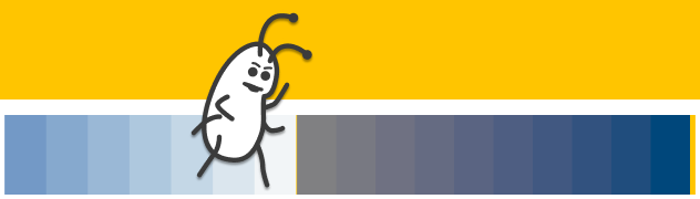
Reliving the Blues, punctuated with brief bursts of incredibleness. The color ramps are scaled to represent the years spent working with each palette.
I had applied my initial exploration with defining a Design Language to a secret corner of my site to validate my approach. I thought it worked well, and so I followed it with confidence at work, quickly blazing a fairly disruptive trail there - littered with the bodies of outdated design systems and redundant apps. It shaped some of the most successful internal products there, but it also ran into stiff resistance from a few bipedal beings who based their brand decisions on a "because I said so" approach (with predictable results). I should thank them though, as it only confirmed the need for the sort of robust, logical system I was looking to employ. Speaking of employment, I am free of that uniquely human pursuit as I write this.
I'll touch on just one element of brand here. You get an AAA if you guessed it was "color".
Unpalatable Palettes
At most mature firms, a brand palette is likely to have been already defined and employed for years in marketing material. While these colors are (hopefully) defined in a way that keeps in mind the psychological effect color can have, accounts for cultural nuances, and is aligned to the personality of your brand - they are almost never defined keeping in mind what the firm's web and mobile applications should look like.
Applications need to be easy to navigate, clearly communicate state, help with productivity (in most cases), and above all, be accessible. I'd be surprised if your organization's brand palette started out with defining what an error message should look like, for example, when they were picking a shade of red as an "accent color".
To be able to design our apps, we almost always need to define a system of colors that goes beyond the brand palette. Sadly, many designers define a ramp of shades and tints based on the brand colors, and call it a day. These ramps come with a few hurdles:
- Too many colors, with little guidance on when to use which. This leads to inconsistent use in larger teams and across designs.
- Little consideration for what color combinations would fail accessibility requirements. (This seems to have improved vastly in the past few years though.)
- Does not factor in perceptual differences in how we see color. This leads to unequally spaced ramp steps.
What's the RGB for a Silver Lining?
In an ideal world, the colors you employ in your app designs derive from your brand, so that your users are reminded subtly of it as they go about their journey. Each is picked intentionally and used for a specific purpose only. They are guaranteed to meet accessibility criteria when used together. And they are used in the right proportions to create a harmonious yet usable interface.
I built out a way to meet all these criteria using Excel. (What can I say, I'm a fan of using Microsoft Office to democratize design steps. How I created mockups for complex equities trading apps using PowerPoint is a story for another day.)
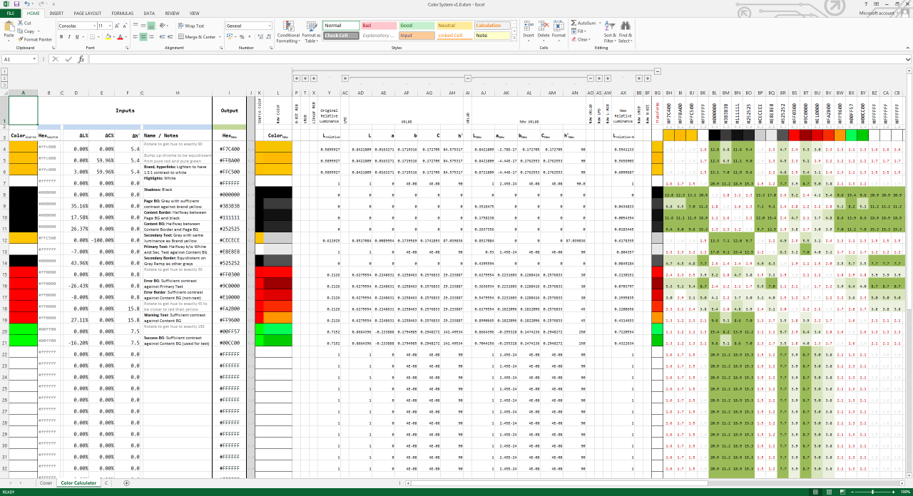
Behold! My (slightly scary) Masterpiece!
The core premise of my solution is this. We want a way to:
- Derive colors to meet accessibility requirements, so that we don't have to rework our palette when testing for them after the fact.
- Stay within the hues defined by our brand, so that they don't look out of place.
- Get around the limitations of the RGB color space, so that we have a more intuitive, perception-based way to tweak our colors.
The colors you see on this article page, in fact, have been derived using this tool. Feel free to give it a spin for your own work. The Excel file uses a VBA script to paint the cells to the Hex colors you enter or generate. You will need to enable Macros when you open the file for this to work feature to work.

You can reach out to me on LinkedIn if you've got questions or feedback.
Some Color on How it Works
The problem with working with Hex or RGB values, is that if you needed to change, say, just how light the color is so as to increase its contrast with a background color, you would struggle to pick the right combination of changes needed to the R, G and B components of the color to do this. You could use a "lighten" function in Sass, but the output of the function will not look uniformly lighter for all colors you pass through it. This is because of differences in how the human eye perceives different colors.
If you want to create a perceptually uniform ramp of colors, you will need to translate your colors from the RGB space into a Uniform Color Space, like provided by CIECAM.
I had previously attempted to use the CIECAM02 model, but it is quite complex to work out. It's also been superseded by CAM16, which both improves on and simplifies it. However, the paper that explains the CAM16 model costs 120 Euros - not something I am going to put down while I'm unemployed. Happily, I found a model that actually takes the best parts of CAM16 and also avoids some of its pitfalls. But most importantly, Björn Ottosson, it's author, nicely explains how it works. AND he's not putting up pay walls to stop you from using it. AND WAIT! It gets even better! He's also worked on the Frostbite engine I previously raved about… AND his model is intended to be part of the CSS4 draft specification. Despite all these fantastic things, it's called OKLab…
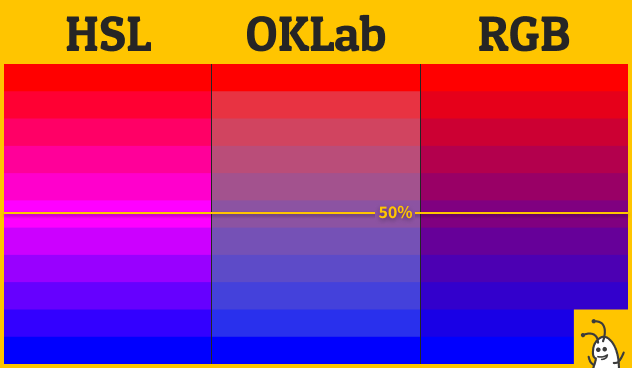
If you haven't already been blinded by HSL going completely off the rails with that hot pink, you'll notice OKLab has the smoothest transition from red to blue. RGB is not terrible, but does venture into purples that look darker.
My Excel solution takes a Hex color code as input and converts it to the OKLab color space for us to perform color operations. By converting colors into this space, we can change the perceived Luminance L of a color without affecting its hue h or Chroma C. Luminance, more specifically relative Luminance, is what is used to test contrast ratios for Accessibility. With both L values available to us for a pair of colors, we can enter values into the ΔL cell manually to get the desired contrast ratio, but this gets boring fast.
Notice the grid of numbers to the right in the Excel sheet? That lets us use Excel's "Goal Seek" functionality to derive the ΔL value that will give us the required contrast we seek.
Combining this with the other controls for ΔC and Δh, we can approach defining a palette of colors, each picked through calculations and derived from a small set of brand colors. No more random, unevenly spaced ramps with dozens of colors that you'd be hard-pressed to define rules to use around. And guaranteed color contrast from the get go.
More Battles Ahead…
I do have a few more enhancements planned for the Excel solution. My previous research introduced me to some of the incredible work done by Machado, et al., in simulating color blindness, and while I have toyed with using their transforms successfully to see the effect on existing palettes, I want to see how I can apply them to help generate alternative color palettes for people with color vision deficiencies.
Incidentally, the Battlefield games built on the Frostbite engine Björn worked on allow players to change how interface colors look from their settings screen. Funny how games are way ahead of enterprise software in supporting accessibility requirements.
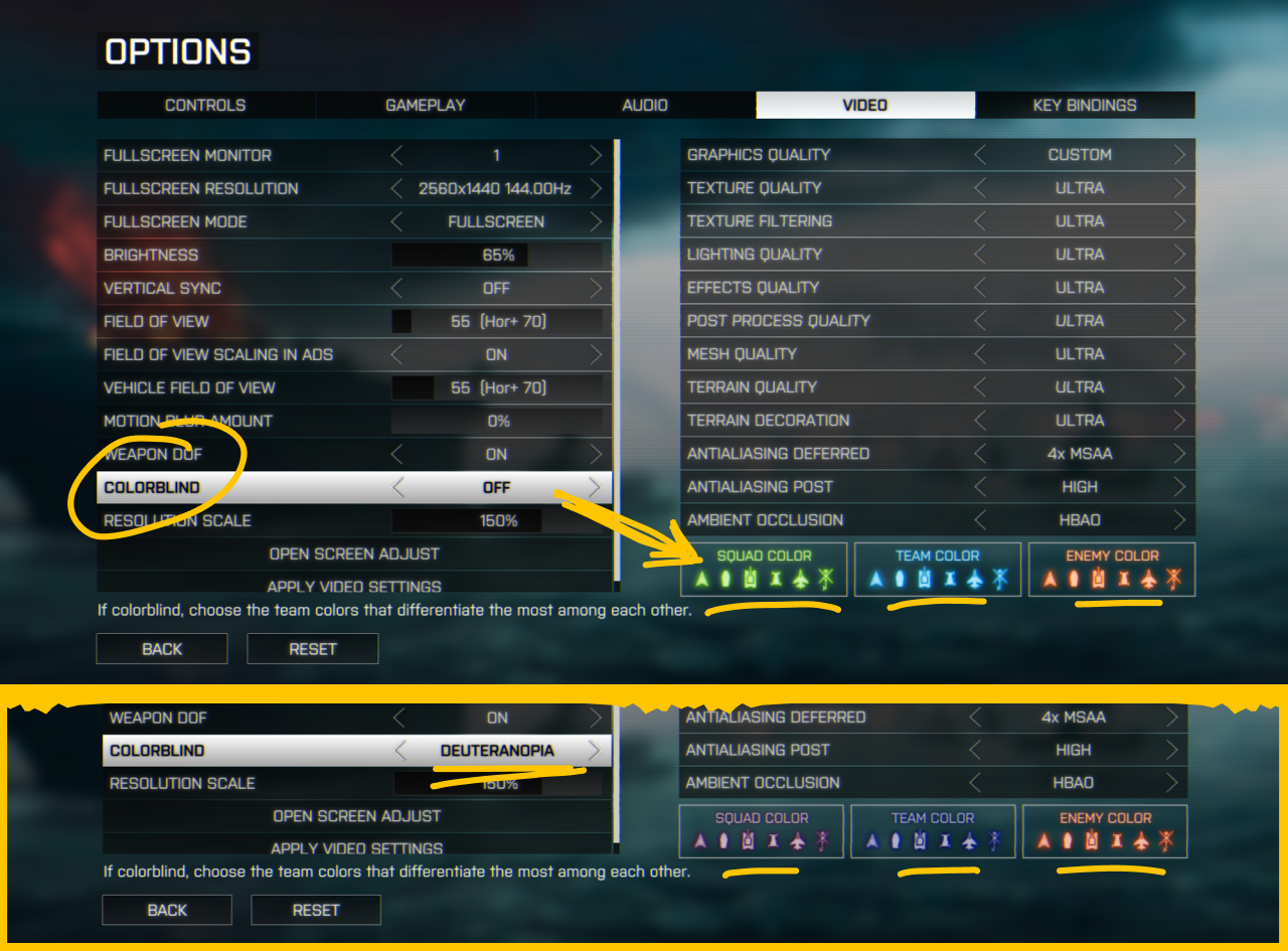
Battlefield 4 allows you to switch between Deuteranopia, Tritanopia and Protanopia modes for your map markers. Because friendly fire can be deadly.
I also want to have a way to calculate similar transforms to convert between light and dark themes so that we can invert the colors on an app without changing the intended relative perceptual differences of the colors used. I have not seen good examples of this so far, because the way we perceive colors is also altered significantly by the colors adjacent to them. It's what makes optical illusions like this one work…
A demo of lightness perception pic.twitter.com/BSVpgcuIw1
— Akiyoshi Kitaoka (@AkiyoshiKitaoka) August 12, 2018
Your mind blown yet?
The iCAM model looks promising in this respect. I will need to do a lot more background study before I can comprehend it though - these things are complex! Until then, I hope you find even my rudimentary solution useful to approach your color decisions in a better way.